
What Is Color Grading? The Ultimate Guide to Cinematic Video
Color grading is the creative process of adjusting the colors in your video to achieve a specific look, mood, or aesthetic. Think of it as the difference between a snapshot and a cinematic masterpiece. While your raw footage might look flat or lifeless, color grading transforms it into something that evokes emotion and tells a story visually. It's how filmmakers create those distinctive looks you see in movies, whether that's the warm golden tones of a summer romance or the cool blue hues of a thriller.
This guide breaks down everything you need to know about color grading for video. You'll learn why event organizers rely on color grading to make user generated content look professional, how it differs from basic color correction, and the specific techniques and tools that turn amateur footage into compelling visual stories. We'll cover practical workflows, essential terminology, color theory principles, and strategies for grading smartphone clips from your attendees. By the end, you'll understand how to give any video that polished, cinematic quality that captures attention and drives engagement.
Why color grading is essential for event video
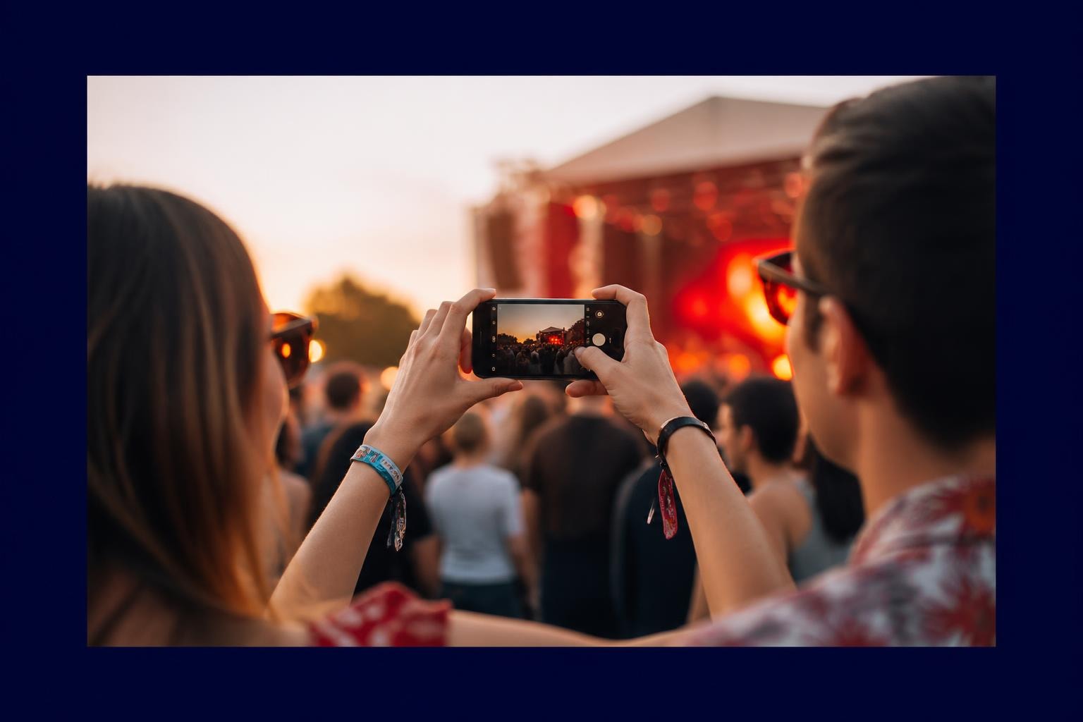
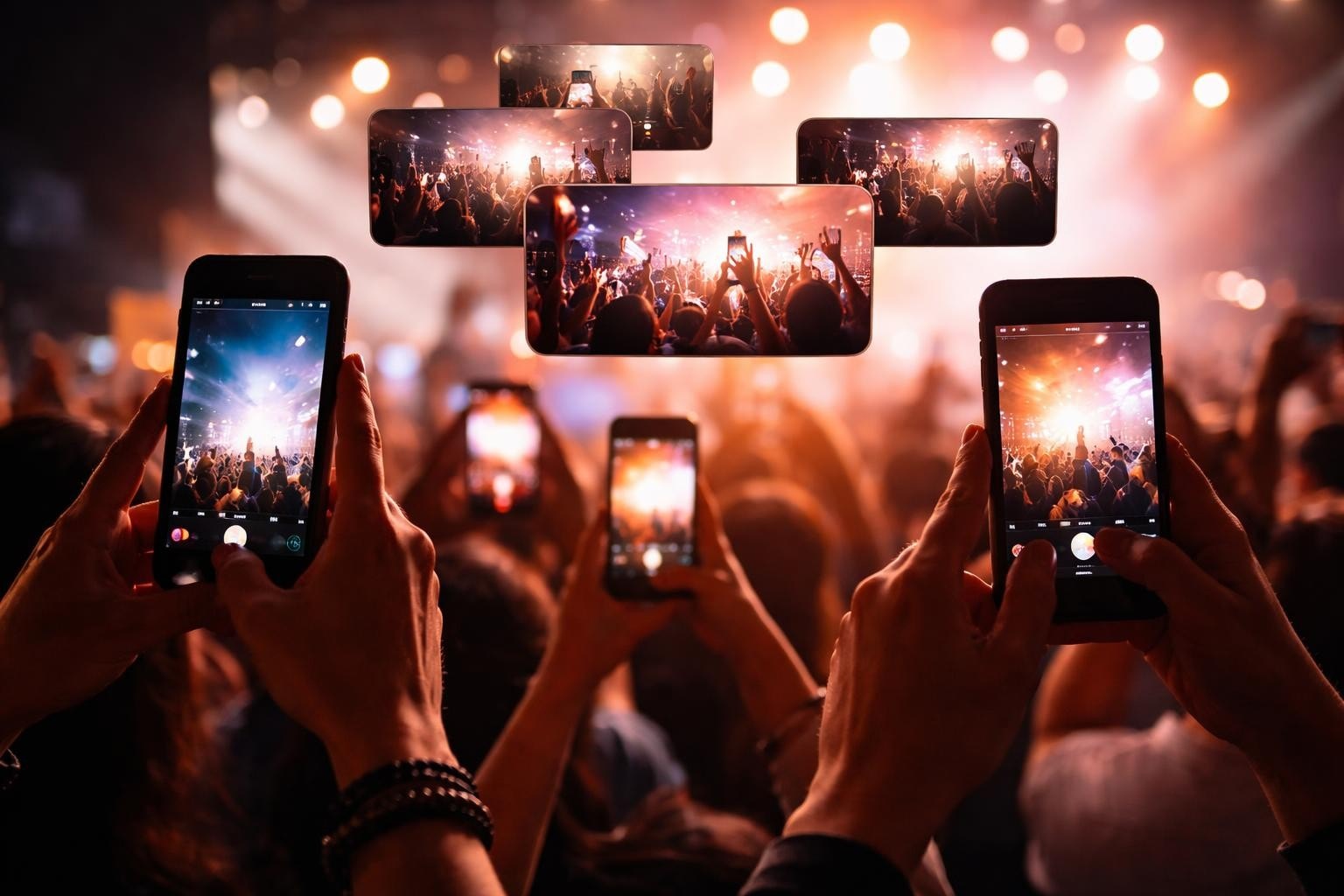
Event organizers face a unique challenge when collecting user generated content from attendees. You receive dozens or hundreds of video clips shot on different smartphones, under varying lighting conditions, and with no consistency in color, exposure, or visual style. Without color grading, your event footage looks like a disjointed collection of random clips rather than a cohesive story. Color grading transforms this chaos into a unified visual experience that reflects your event's energy and professionalism.
Making smartphone footage look consistent
Your attendees capture moments on everything from the latest iPhone to older Android devices, each with different color science and processing. A Samsung Galaxy produces cooler, more saturated tones, while an iPhone tends toward warmer, more neutral colors. When you compile these clips without grading, the result looks jarring and unprofessional. Color grading brings all this footage into harmony by adjusting the temperature, tint, and saturation so every clip shares the same visual language. You establish a baseline look that makes viewers forget they're watching content from multiple sources.
Different lighting conditions at your event create additional inconsistency. Footage shot during golden hour looks warm and inviting, while clips from inside a venue under fluorescent lights appear cold and flat. Grading corrects these variations so your final video maintains a consistent atmosphere from start to finish, regardless of when or where attendees captured their clips.
Building brand identity through visual style
Your event has a brand, and color grading reinforces that identity in every frame. Music festivals often use vibrant, saturated colors to convey energy and excitement, while corporate conferences benefit from clean, professional tones that communicate sophistication. When you apply signature color treatments to your video content, you create a recognizable visual style that audiences associate with your brand. This consistency builds trust and makes your event instantly identifiable across social media platforms.
"Color grading isn't just about making footage look pretty. It's about creating a visual signature that audiences recognize and remember."
Grading also helps you align video content with your marketing materials. If your event posters, website, and graphics use specific color palettes, your video should match. This cohesion strengthens brand perception and creates a seamless experience for your audience across all touchpoints.
Increasing audience engagement and watch time
Professionally graded video content holds attention longer than flat, unprocessed footage. Viewers scroll past amateur looking content within seconds, but videos with polished color work signal quality and professionalism. Your audience subconsciously associates good color grading with content worth watching, which directly impacts engagement rates, shares, and comments. When your event highlights look cinematic, people stop scrolling and start watching.
The emotional impact of color grading matters for event promotion. Warm tones make viewers feel nostalgic and connected, while cooler grades create anticipation and excitement. You control the emotional response through color choices, which influences whether someone decides to attend your next event. Better engagement translates to more ticket sales, stronger community building, and increased organic reach on social platforms.
Transforming amateur clips into professional assets
Understanding what is color grading means recognizing its power to elevate raw user generated content into marketing gold. Your attendees capture authentic moments that no professional videographer could stage, but these clips often lack the polish needed for promotional use. Grading bridges that gap by giving amateur footage a professional finish while preserving its genuine, unscripted energy. You get content that feels real and relatable but looks good enough to use in official campaigns.
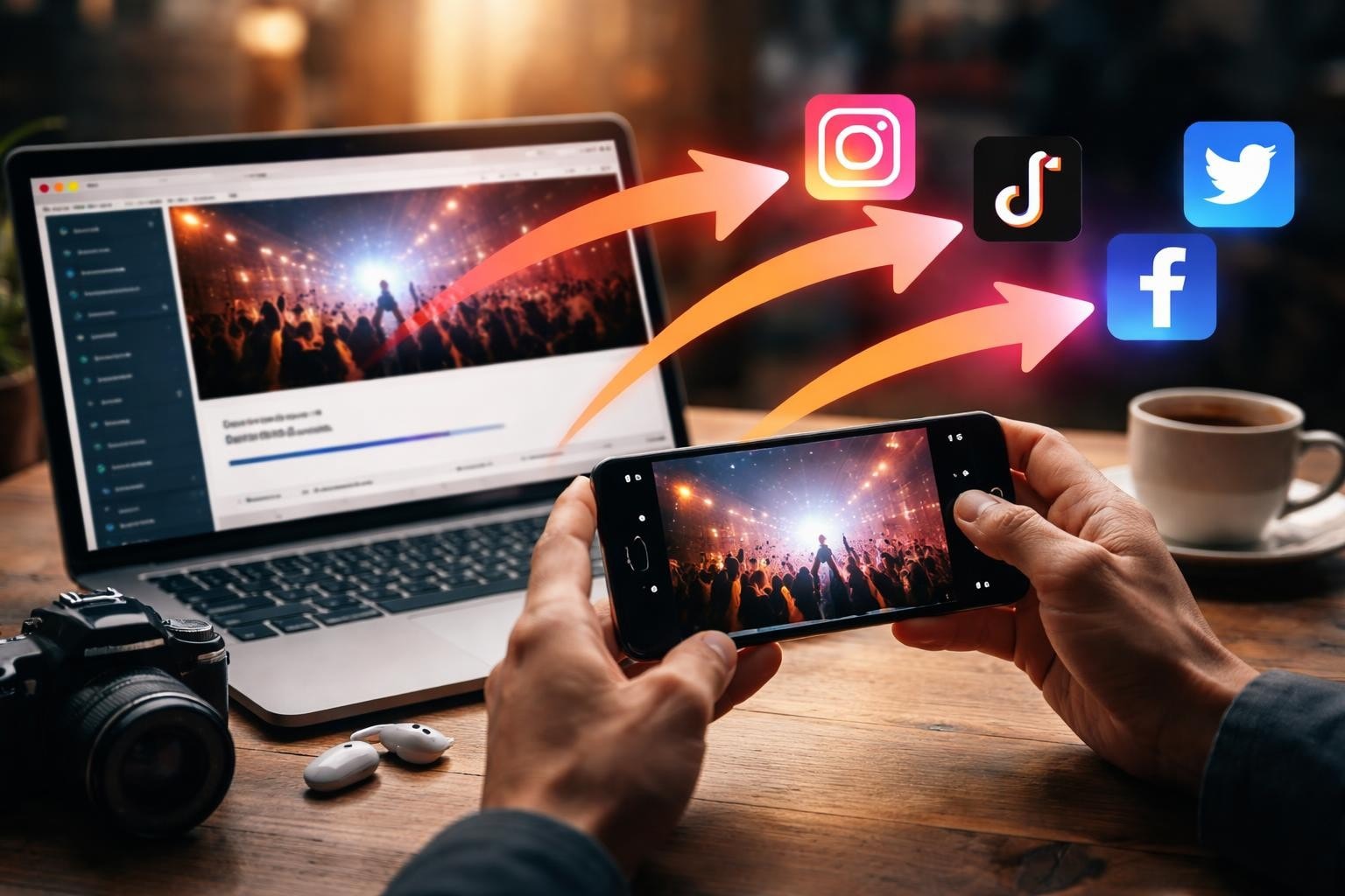
This transformation saves you money on content production. Instead of hiring a full video crew to capture every angle of your event, you leverage the content your attendees already create and enhance it through grading. The result is abundant, authentic video content that performs better in marketing contexts than traditional promotional material because it comes from real experiences shared by real people.
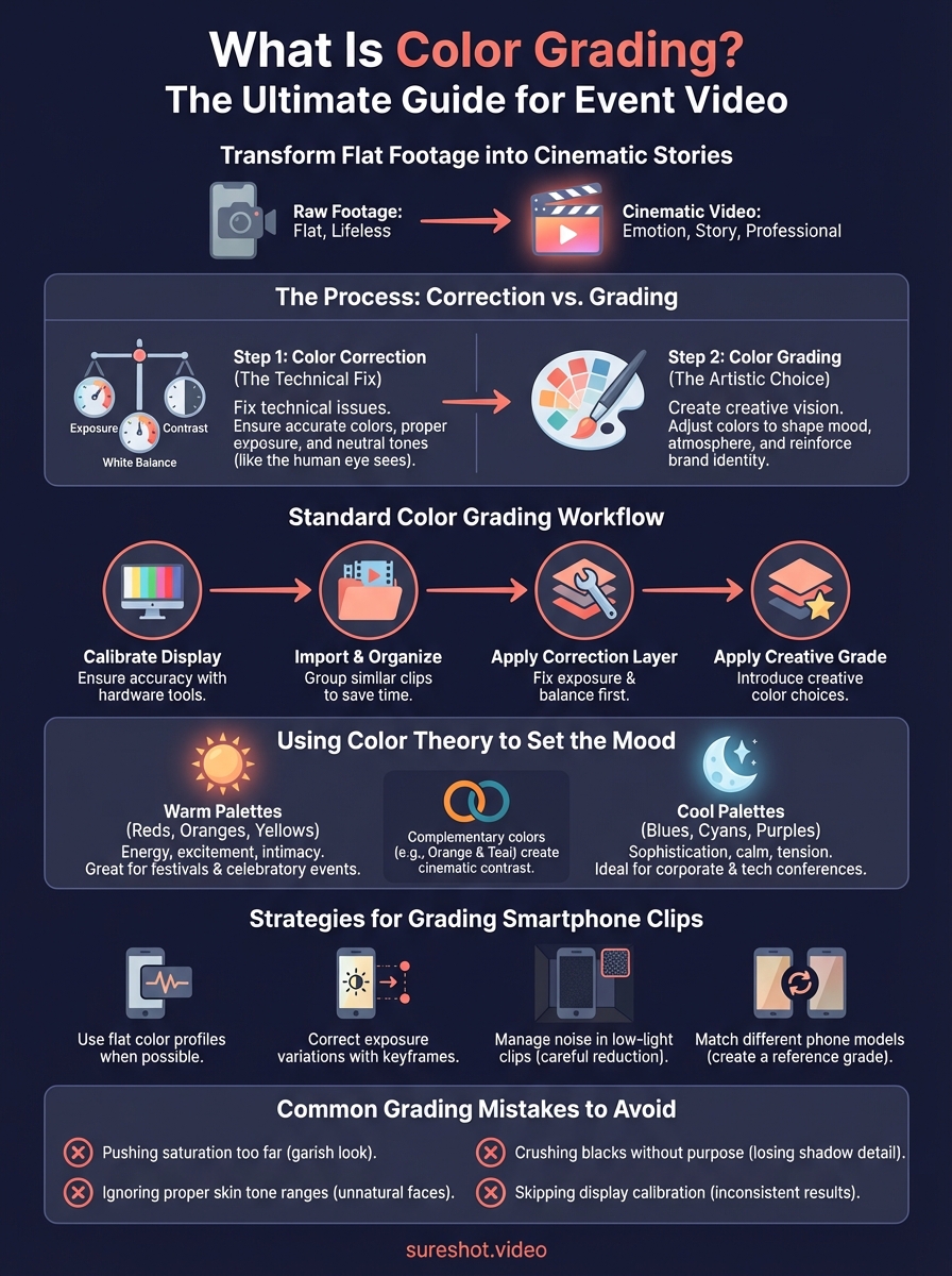
Difference between color correction and grading
People often confuse these two processes, but they serve distinct purposes in your video workflow. Color correction happens first and focuses on fixing technical problems in your footage. It ensures your clips have accurate white balance, proper exposure, and neutral colors that match what the human eye would see in real life. Grading comes second and transforms those corrected clips into a specific creative vision. Understanding what is color grading versus correction helps you approach each step with the right mindset and tools.
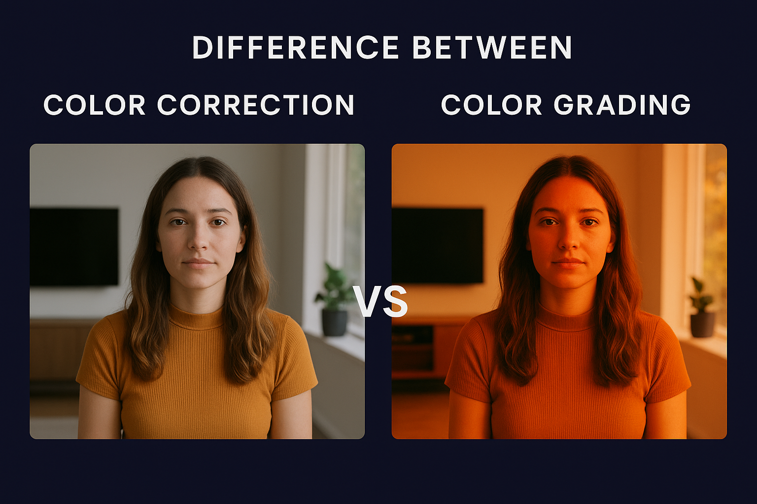
Color correction comes first in your workflow
Your smartphone footage arrives with technical flaws that need fixing before any creative work begins. Some clips look too dark because an attendee filmed in low light, while others appear washed out from harsh sunlight. Color correction addresses these issues by adjusting exposure, contrast, and white balance to create a neutral, balanced starting point. You bring shadows up to reveal detail, pull highlights down to prevent blown out areas, and correct any color casts that make skin tones look unnatural.
This technical step ensures every clip operates within proper exposure ranges and displays colors accurately. When you correct footage shot under tungsten lighting, you remove the orange cast. Clips filmed under fluorescent lights lose their green tint. You also match the exposure and contrast across all your clips so they exist in the same visual space before you apply any creative treatments.
"Color correction is about truth. Color grading is about emotion."
Color grading creates the artistic look
After correction establishes a neutral baseline, grading introduces creative color choices that shape mood and atmosphere. You might push your footage toward warm, golden tones to create a nostalgic feel for a summer festival, or apply cool, desaturated blues for an edgy electronic music event. Grading uses color wheels, curves, and HSL adjustments to craft a distinctive visual style that goes beyond what the camera captured. This creative process defines how your audience feels when watching your content.
Professional colorists apply selective color adjustments to specific parts of the image. You might boost the saturation of neon signs while keeping skin tones natural, or isolate and enhance the colors of your event branding throughout the footage. Grading also involves crushing blacks for a filmic look, adding vignettes for focus, or creating color contrast between foregrounds and backgrounds.
When to apply each technique
Every clip requires correction first, grading second without exception. Attempting to grade uncorrected footage leads to inconsistent results because you're building creative choices on top of technical problems. Your workflow should separate these processes mentally and practically so you address exposure and balance issues before making artistic decisions. Corrected footage gives you a clean canvas where grading choices work predictably across all your clips.
How to color grade video in a standard workflow
Grading video follows a structured, repeatable process that ensures consistent results across all your event footage. This workflow breaks down into distinct phases that build on each other, moving from technical setup through correction and into creative grading. Understanding what is color grading in practical terms means following a systematic approach that prevents mistakes and saves time when you're processing multiple clips from your event attendees.
Start with a calibrated display
Your monitor displays colors differently from factory settings, which means you need accurate color calibration before grading any footage. An uncalibrated screen shows colors that don't match what viewers see on their devices, leading to grades that look wrong everywhere except your workstation. Professional colorists use hardware calibration tools like the X-Rite i1Display Pro or Datacolor SpyderX to ensure their monitors reproduce colors accurately. These devices measure your screen's output and create correction profiles that compensate for any color shifts or brightness inconsistencies.
Without calibration, you work blind. Your monitor might display everything too warm, causing you to overcorrect toward cooler tones that look unnatural on properly calibrated displays. Set your monitor brightness to around 120 cd/m² for grading work, which prevents eye fatigue and matches standard viewing conditions for most audiences.
Import and organize your footage
Organizing clips before grading saves hours of frustration during the actual color work. Create a logical folder structure that separates footage by location, time of day, or camera source so you can quickly find and group similar clips. Tag clips that need extra attention for exposure or white balance issues, and create bins for different parts of your event like performances, crowd reactions, and behind the scenes moments. This organization lets you apply similar grades to similar footage, maintaining consistency while working efficiently.
Build your correction layer
Start every project by correcting exposure and white balance across all clips using your editing software's color correction tools. Adjust the exposure slider to bring midtones into proper range, then use highlight and shadow controls to preserve detail in bright and dark areas. Set white balance by identifying a neutral gray element in each clip and using the eyedropper tool to remove color casts. This technical foundation ensures your footage looks natural before you introduce creative choices.
"A solid correction layer is the difference between professional results and amateur mistakes. Never skip this step."
Apply your creative grade
After correction, you introduce creative color treatments that define your event's visual identity. Choose a color palette that matches your brand, then use color wheels to push shadows, midtones, and highlights toward those hues. Adjust saturation to enhance vibrancy without making skin tones look artificial, and apply subtle vignettes or contrast adjustments to direct viewer attention. Save your grade as a preset so you can apply the same look across multiple clips with minor adjustments for each unique shot.
Key terminology and tools you need to know
Learning what is color grading requires familiarity with specific terms and tools that colorists use daily. This vocabulary helps you communicate your creative vision, understand tutorials, and navigate your editing software with confidence. Mastering these fundamentals transforms color grading from an intimidating technical process into a creative toolkit you control with precision and intention.
Essential color grading terms
Lift, gamma, and gain control different tonal ranges in your image, giving you precise adjustments across shadows, midtones, and highlights. Lift affects the darkest parts of your footage, gamma targets the middle tones where most visual information lives, and gain controls the brightest areas. You adjust these parameters using color wheels in your grading software, pushing each range toward specific hues while maintaining proper exposure. Understanding this three way color corrector setup unlocks professional control over your footage's entire tonal range.
LUTs (Look Up Tables) function as preset color transformations that instantly apply complex grade combinations to your footage. They map input color values to output values, creating everything from subtle film emulations to dramatic stylized looks. You apply LUTs after correction to quickly establish a creative direction, then fine tune the result with additional adjustments. Professional colorists often create custom LUTs for specific events or brands, ensuring consistent visual identity across all video content.
Understanding scopes and tools
Waveform monitors, vectorscopes, and histograms provide objective measurements of your footage's color and exposure values, preventing you from relying solely on your eyes. The waveform shows brightness levels from black to white, helping you identify clipping and maintain proper contrast. Vectorscopes display color information on a circular chart, making it easy to spot color casts and ensure skin tones fall within acceptable ranges. Histograms reveal your image's tonal distribution, showing whether you have sufficient detail in shadows and highlights.
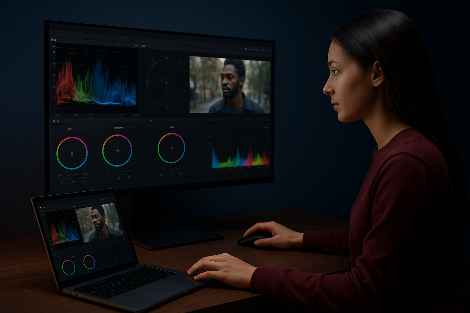
"Scopes don't lie. Your eyes adjust to what you're seeing, but scopes show you the actual data."
These tools become critical when grading smartphone footage from multiple sources because they reveal technical problems that aren't immediately visible on your monitor.
Nodes and adjustment layers
Serial and parallel nodes structure your color work into organized, non-destructive steps that you can adjust or remove without starting over. Serial nodes apply corrections and grades in sequence, with each node building on the previous one's output. Parallel nodes process the same input simultaneously, letting you create complex looks by blending multiple treatments together. This node-based workflow gives you the flexibility to experiment with different creative directions while maintaining a clean correction foundation underneath.
Using color theory to set the mood
Color theory provides the foundation for every creative grading decision you make when processing event footage. Understanding what is color grading at a deeper level means recognizing how specific color combinations trigger emotional responses in your viewers. Colors communicate feelings without words, shaping how audiences perceive your event before they consciously process the content. You apply these principles systematically to create cohesive visual narratives that reinforce your event's atmosphere and brand identity across all user generated clips.
Warm versus cool color palettes
Temperature defines the primary emotional direction of your grade and dramatically affects viewer perception. Warm colors like oranges, reds, and yellows create feelings of energy, excitement, and intimacy, making them perfect for summer festivals, concerts, and celebratory events. You push your footage toward these tones by adding red and yellow to your midtones and highlights, creating an inviting atmosphere that feels approachable and fun. Cool colors including blues, cyans, and purples evoke sophistication, calm, or tension depending on saturation levels, working well for corporate events, tech conferences, or evening gatherings.
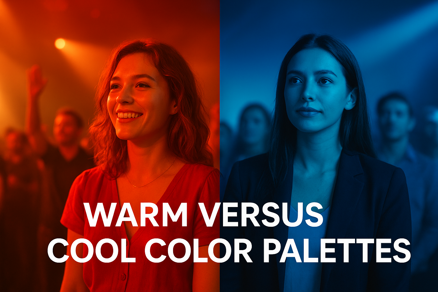
"Temperature choices set the emotional baseline before viewers notice anything else about your footage."
The contrast between warm and cool elements within a single frame creates visual interest and depth. You might grade skin tones warm while pushing backgrounds toward cooler hues, separating subjects from their environment and directing attention exactly where you want it.
Complementary and analogous schemes
Complementary colors sit opposite each other on the color wheel and create maximum visual contrast when paired together. Orange and teal, the most common complementary pair in modern color grading, produces a cinematic look that feels polished and intentional. You apply this by warming skin tones and foreground elements while cooling shadows and backgrounds, creating separation and visual pop. Purple and yellow offer another complementary combination that works particularly well for nighttime event footage where you want to emphasize artificial lighting against darker environments.
Analogous color schemes use colors adjacent on the wheel for harmonious, unified looks. An analogous palette of red, orange, and yellow creates cohesive warmth throughout your frame, while blue, cyan, and teal produces cool consistency that feels modern and sleek.
Emotional associations of specific hues
Individual colors carry cultural and psychological associations that influence how viewers respond to your content. Red signals passion, energy, and urgency, making it powerful for music festivals and high energy events but potentially overwhelming if oversaturated. Blue conveys trust, professionalism, and calm, which explains its popularity in corporate video content and technology events. Green suggests growth, nature, and freshness, working well for outdoor events or sustainability focused gatherings.
You combine these associations strategically based on your event's goals. A wellness retreat benefits from soft greens and earth tones that reinforce natural themes, while a fashion show might use saturated magentas and purples to communicate creativity and luxury.
Top software choices for video editing
Choosing the right software determines how efficiently you grade your event footage and what creative options you have access to. Your software needs depend on your budget, technical skill level, and the volume of footage you process regularly. Professional colorists rely on dedicated grading applications that offer precise control over every aspect of color manipulation, while event organizers working with user generated content often find success with all-in-one editing platforms that combine cutting, grading, and export functions in a single interface.
Professional-grade options for serious projects
DaVinci Resolve stands as the industry standard for color grading and offers a completely free version that includes professional-grade tools most users never outgrow. The software provides node-based grading, advanced scoping tools, and powerful tracking features that let you isolate and adjust specific elements within your frame. Its learning curve feels steep initially, but the investment pays off when you're processing dozens of clips from your event attendees and need consistent, repeatable results. The Studio version costs $295 and adds collaboration features plus advanced noise reduction.
Adobe Premiere Pro integrates editing and grading in one application, making it popular among event organizers who want to cut and color their footage without switching between programs. While its grading tools don't match DaVinci Resolve's depth, Premiere offers enough control for most event video needs and connects seamlessly with other Adobe applications you might already use for graphics and social media content. The subscription model costs $22.99 monthly or comes bundled in Creative Cloud plans.
"The best software is the one you'll actually learn and use consistently. Professional tools mean nothing without the skills to apply them."
Budget-friendly tools for getting started
Final Cut Pro gives Mac users native performance optimization that handles 4K smartphone footage smoothly on older hardware. It costs $299 as a one-time purchase and includes intuitive color wheels, LUT support, and automatic color balance tools that speed up your workflow significantly. Understanding what is color grading becomes easier when your software responds instantly to adjustments without rendering delays.
CapCut offers completely free grading tools that work surprisingly well for basic event footage needs. You get essential color wheels, preset filters, and adjustment layers without subscription fees, making it perfect for organizers testing whether color grading adds value to their content before investing in professional software.
Mobile apps for on-the-go grading
LumaFusion transforms iPads into portable grading stations where you can process footage between events or while traveling. The app costs $29.99 and provides multi-track editing, keyframe controls, and professional color tools that rival desktop applications in capability while fitting in your backpack. You apply corrections and creative grades directly on your tablet, then export finished videos ready for social media distribution.
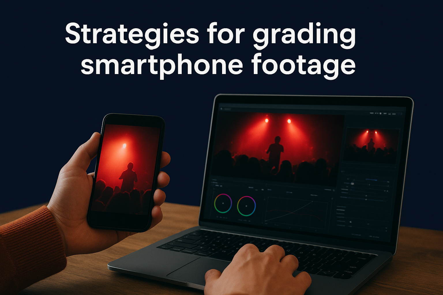
Strategies for grading smartphone footage
Smartphone footage presents unique challenges that require specific grading approaches different from professional camera workflows. Your event attendees capture content on devices with varying color science, limited dynamic range, and inconsistent exposure controls. Understanding what is color grading for smartphone clips means adapting professional techniques to work within the constraints of mobile camera sensors while maximizing the quality of user generated content. These strategies help you transform diverse smartphone footage into cohesive, professional-looking event videos.
Work with flat color profiles when possible
Modern smartphones let users shoot in flat or log color profiles that preserve maximum color information and dynamic range for post-production flexibility. If you can encourage attendees to enable these profiles before filming, you gain significantly more grading latitude and control over the final look. Flat profiles appear washed out and low contrast straight from the camera, but they capture detail in highlights and shadows that standard profiles clip or crush. You add contrast and saturation back during grading, shaping the image exactly how you want without fighting baked-in processing.
"Flat profiles give you creative freedom. Standard profiles give you convenience. Choose based on your workflow needs."
Standard color profiles work fine when you need quick turnaround and minimal grading, but they limit how far you can push adjustments before image quality degrades.
Correct exposure variations first
Smartphone cameras use automatic exposure that shifts constantly during recording, creating clips where brightness fluctuates as attendees move or lighting changes. You address these variations by applying keyframes to your exposure adjustments, tracking the changes throughout each clip and smoothing out jarring transitions. Start by identifying the proper exposure level for each scene, then use keyframes to gradually adjust brightness so the correction feels invisible rather than abrupt.
Clips shot in challenging lighting conditions require selective exposure corrections that target specific areas. An attendee filming a stage performance captures blown-out highlights on performers while the crowd remains too dark. You use masks or luminance keys to separately grade bright and dark regions, bringing performers down and audience members up without affecting the entire frame uniformly.
Manage noise in low-light clips
Low-light smartphone footage contains visible digital noise that becomes more pronounced when you increase exposure during grading. Apply noise reduction before making exposure adjustments to clean up the grain without softening details excessively. Most editing software includes temporal noise reduction that analyzes multiple frames to distinguish between actual image content and random noise patterns, preserving sharpness while smoothing grain.
Heavy noise reduction creates a plastic, overly smooth look that feels artificial. You balance noise removal with natural texture by reducing luminance noise more aggressively than color noise, which often appears less distracting to viewers and maintains a film-like quality in your footage.
Match different phone models
Each smartphone brand applies unique color science and processing that creates distinct looks across your collected footage. Samsung devices typically produce cooler, more saturated images, while iPhones tend toward warmer, more neutral colors. You create a reference grade on one well-exposed clip, then adjust other clips to match by correcting white balance, saturation, and contrast until all footage shares similar characteristics. Save these corrections as presets organized by phone model so you can quickly apply appropriate starting points to new clips from the same device type.
Common grading mistakes to avoid
Even experienced editors make costly errors when grading event footage that waste time and produce subpar results. Understanding what is color grading includes recognizing the technical and creative pitfalls that undermine your work before you publish it. You avoid these mistakes by following systematic workflows, trusting your scopes over your eyes, and respecting the limitations of smartphone footage. Learning what not to do often matters more than mastering advanced techniques because a single mistake can ruin an otherwise polished grade.
Pushing saturation too far
Oversaturating your footage creates an artificial, garish look that screams amateur rather than cinematic. You see this mistake when skin tones shift toward orange or red, skies become unnaturally electric, and clothing colors appear radioactive rather than vibrant. Smartphone footage already carries heavier saturation than professional cameras, so adding more during grading compounds the problem. You check your vectorscope while adjusting saturation to ensure colors stay within broadcast-safe ranges and skin tones remain natural. Small saturation increases of 10-15% often achieve the vibrancy you want without crossing into unrealistic territory.
The temptation to boost saturation hits hardest when grading festival footage where you want punchy, energetic colors. Instead of pushing global saturation, you selectively enhance specific hues that reinforce your event's atmosphere while leaving skin tones and neutral elements untouched.
Ignoring proper skin tone ranges
Skin tones serve as the most important reference point for accurate color grading because viewers instantly notice when faces look wrong. You maintain skin tones along the proper vectorscope line that runs from the center toward the orange/red quadrant, ensuring they fall within acceptable ranges regardless of ethnicity or lighting. Pushing grades too warm makes people appear sunburned, while cooler adjustments create sickly, unnatural complexions that distract from your content.
"When skin tones fail, your entire grade fails. Everything else is secondary."
You verify skin tone accuracy by using the vectorscope and reference images rather than trusting your monitor alone. Faces should maintain consistent color characteristics across all your clips, even when you apply creative grades that shift the overall mood toward warm or cool palettes.
Crushing blacks without purpose
Aggressive black level crushing eliminates shadow detail completely, turning dark areas into solid black voids that flatten your image and reduce depth. You see this mistake when clothing, hair, or background elements lose all texture and dimension, collapsing into featureless silhouettes. While controlled black crush creates a filmic, high-contrast look appropriate for certain event styles, overdoing it destroys visual information you cannot recover. Smartphone footage already struggles with shadow detail, so excessive crushing makes the problem worse.
Check your waveform scope to ensure blacks sit slightly above absolute zero, preserving subtle detail while maintaining rich contrast. You apply black crush selectively based on creative intent rather than automatically pushing every clip toward maximum contrast.
Skipping the calibration step
Grading on an uncalibrated monitor produces inconsistent results that look wrong on every other display. Your screen might show colors too warm, causing you to overcorrect toward cool tones that appear blue and lifeless on properly calibrated devices. You waste hours creating grades that only look correct on your workstation, forcing you to redo everything when you see the results on other screens. Hardware calibration tools cost less than redoing a single project and ensure your color decisions translate accurately across all viewing platforms your audience uses.
Elevating your video content
Understanding what is color grading empowers you to transform raw event footage into professional visual stories that capture attention and drive engagement. You now recognize the technical foundations that separate correction from creative grading, the workflow steps that ensure consistency across diverse smartphone clips, and the color theory principles that evoke specific emotional responses in your audience. These skills turn user generated content from your event attendees into polished marketing assets that reflect your brand identity and amplify your event's impact across social media platforms.
The challenge remains collecting and managing all that attendee footage efficiently before you can apply your new grading knowledge. SureShot simplifies this process by giving you a centralized platform where attendees easily upload their clips through unique event PINs, while AI assistance helps you identify the best moments worth grading. You spend less time hunting for content and more time crafting the cinematic look that makes your event unforgettable. Ready to streamline your event video workflow? Book a demo to see how SureShot transforms attendee footage into professional content.