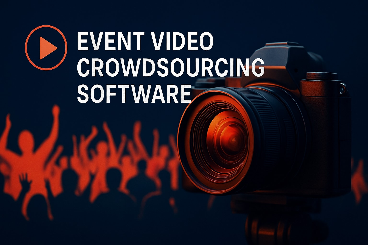

You've seen them everywhere. A quick video on how to use something, whether it's a new app, a festival wristband system, or navigating an event venue. Some are brilliant. Most are rubbish. The difference isn't budget or fancy equipment. It's whether the creator actually thought about what the viewer needs to know versus what they felt like showing.
Here's the thing about instructional content: people only watch when they're stuck or confused. They're not there for entertainment. They want answers, fast. And if you're running events where attendees create content, you need them to know exactly what to do without a three-hour training session.
What Makes a Video on How to Use Actually Useful
Most instructional videos fail because they're made for the person creating them, not the person watching. The creator knows everything already, so they skip the obvious bits. Or they over-explain the simple parts and rush through the complex ones.
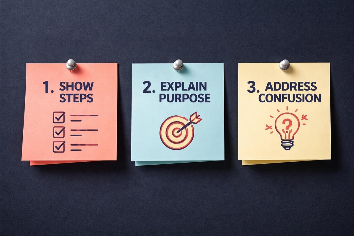
A good video on how to use something does three things:
- Shows the exact steps in order
- Explains why each step matters
- Anticipates where people get confused
That's it. No fancy intros. No motivational music. Just clear information that solves a problem.
The Length Problem Everyone Gets Wrong
Everyone quotes different numbers for ideal video length. Some say 30 seconds. Others say six minutes. The truth? It depends on what you're teaching.
If you're showing attendees how to capture event moments on your platform, that's probably 90 seconds. If you're explaining your entire content submission process, maybe four minutes. Keeping videos focused and concise actually means something different for every topic.
Here's a better rule: your video should be exactly as long as it takes to show someone what to do, once, clearly. Not faster. Not slower. If you can trim 20 seconds without losing clarity, trim it. If you need an extra minute to prevent confusion, take it.
Planning Your Instructional Content
You don't need a film degree. You need a plan.
Before you record anything, write down every single step. Then test it on someone who's never done the task before. Watch where they hesitate. Those moments are where your video needs more detail.
The Script Question
Should you script your video on how to use your platform or tool? Depends on how good you are at talking.
Some people can explain things clearly off the cuff. Most can't. We ramble. We use filler words. We forget steps. A loose script, even just bullet points, keeps you on track without sounding like you're reading from a teleprompter.
Clarity and brevity in instructional videos is easier to achieve when you've thought through what you're going to say beforehand.
| Approach | When to Use | Pros | Cons |
|---|---|---|---|
| Full script | Complex topics, multiple steps | Consistent, clear, no rambling | Can sound robotic |
| Bullet points | Simple processes, confident speakers | Natural, authentic | Risk of forgetting details |
| No script | Very short videos, experienced creators | Fast to produce | Often needs multiple takes |
Recording Basics That Actually Matter
Forget about cinematic lighting and professional studios. Your attendees will record on their phones in noisy venues. Your instructional content should reflect that reality while being clear enough to follow.
Three things make or break instructional video quality:
- Audio clarity - People will tolerate mediocre video if they can hear you. They won't tolerate great video with terrible sound.
- Visible actions - If you're showing how to tap a button, make sure people can see the button. Obvious, right? Yet constantly ignored.
- Consistent pacing - Don't rush the tricky bits. Don't drag out the easy ones.
Record on your phone. Use decent light. Get close enough that text is readable. That's the baseline.
The Authenticity Advantage
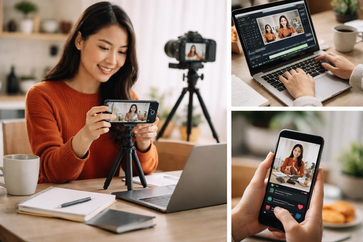
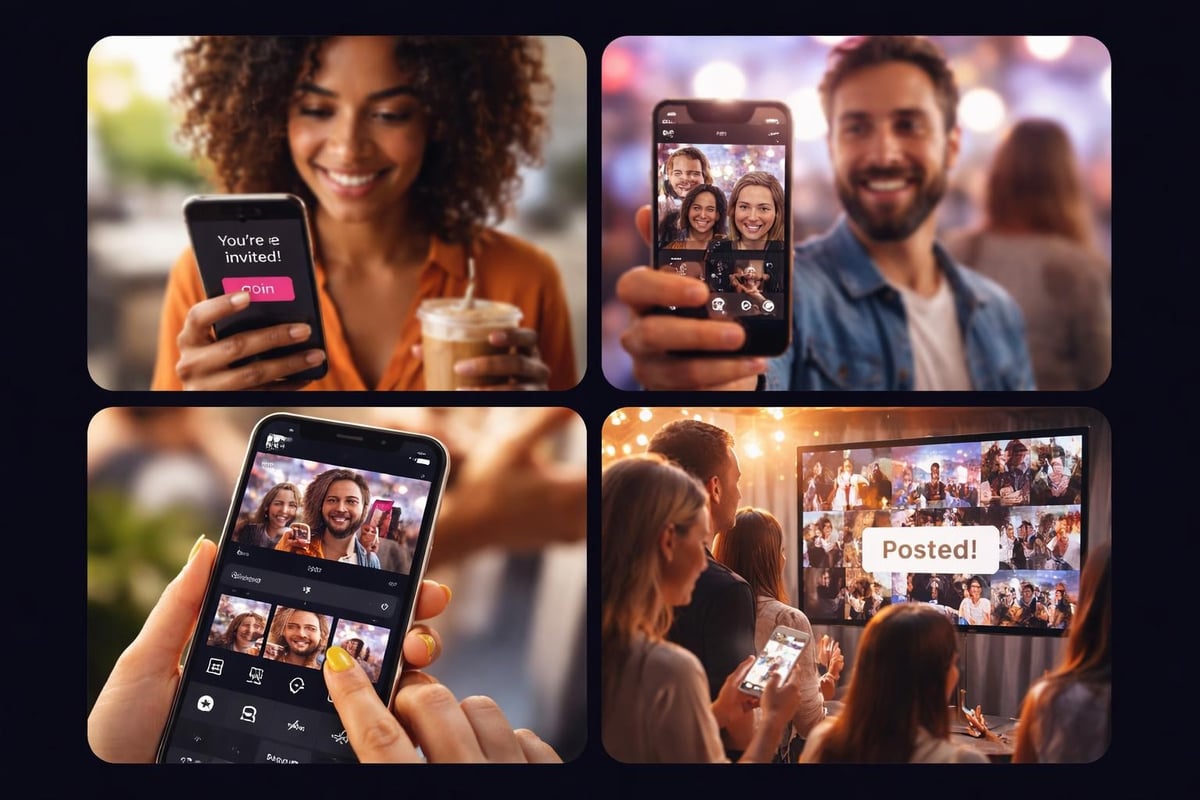
Here's where user-generated content wins. When attendees create a video on how to use your platform to share their experience, it's real. No corporate polish. No marketing speak. Just someone figuring it out and showing others.
That authenticity matters more than production value. People trust other attendees more than they trust official channels. They see someone like them successfully doing the thing, and suddenly it seems achievable.
This is why choosing the right UGC platform matters. You need something intuitive enough that users can create helpful content without friction.
Structure That Works Every Time
Every video on how to use something needs the same basic structure. Don't reinvent this. It works because it matches how people actually learn.
The Three-Part Framework
Part one: What are we doing and why? (10 seconds maximum)
Tell people what they're about to learn. "I'm going to show you how to submit your video to the event gallery" is enough. Don't spend 30 seconds on preamble.
Part two: Here's how to do it (80% of your video)
Show each step. Do it in real-time or slightly faster, but not so fast people can't follow. Keeping videos under six minutes and starting with clear objectives keeps people engaged.
If a step takes 10 seconds to complete, show 10 seconds. Don't jump cut through it unless you're certain everyone will understand.
Part three: What happens next (10-15 seconds)
After they complete the steps, what should they expect? "Your video will appear in the gallery within a few minutes" or "You'll get a notification when it's approved." Close the loop.
Common Mistakes That Kill Instructional Videos
You've probably made these. Everyone has. Recognizing them is the first step to not repeating them.
Assuming knowledge: You know your platform inside out. Your users don't. Every assumption you make creates potential confusion. When showing attendees how to curate content on your platform, explain everything.
Skipping the why: People follow instructions better when they understand the reason. "Tap the blue button to confirm your consent" is better than just "tap the blue button." One second of context prevents confusion.
Too many options: If your platform has five ways to do something, pick one for the instructional video. Show the easiest path. Document the alternatives elsewhere.
No visual hierarchy: Everything can't be important. Highlight the buttons people need to tap. Zoom in on the relevant parts. Direct attention deliberately.
Making Videos People Actually Finish
Video length, scripting, and conversational tone all impact whether people stick around. But there's more to it.
People abandon instructional videos when they get bored or confused. Boredom comes from unnecessary content. Confusion comes from unclear explanations or missing steps.
The fix for boredom: cut everything that isn't essential. The fix for confusion: test your video on someone new.
Testing Your Instructions
Find someone who's never used your platform. Don't help them. Just watch them try to follow your video on how to use it. Every time they pause, rewind, or look confused, that's a problem spot.
You'll be tempted to jump in and explain. Don't. Note where they struggle, then fix the video. Add a second explanation. Show the step from another angle. Whatever it takes to remove that friction point.
Platform-Specific Considerations
Different platforms need different approaches. A video on how to use a desktop application looks different from mobile app instructions.
For event attendees using phones, which is basically everyone:
- Vertical format works better - They're holding their phones normally. Don't make them rotate.
- Bigger buttons and text - What's readable on your laptop screen might be tiny on a phone.
- Shorter segments - Mobile users have less patience for long explanations.
Understanding how to convert horizontal video to vertical becomes relevant when you're repurposing content across different platforms and contexts.
The Editing Question
How much editing does a video on how to use something actually need? Less than you think, more than zero.
You don't need transitions, effects, or background music. You do need to cut out the mistakes, the long pauses, and the irrelevant bits. A jump cut is fine. People understand that you've removed dead time.
What you're optimizing for is clarity and pacing. If a step takes 30 seconds of watching a progress bar, speed that up or cut it down. If you fumbled through an explanation, record it again. Simple edits that respect the viewer's time.
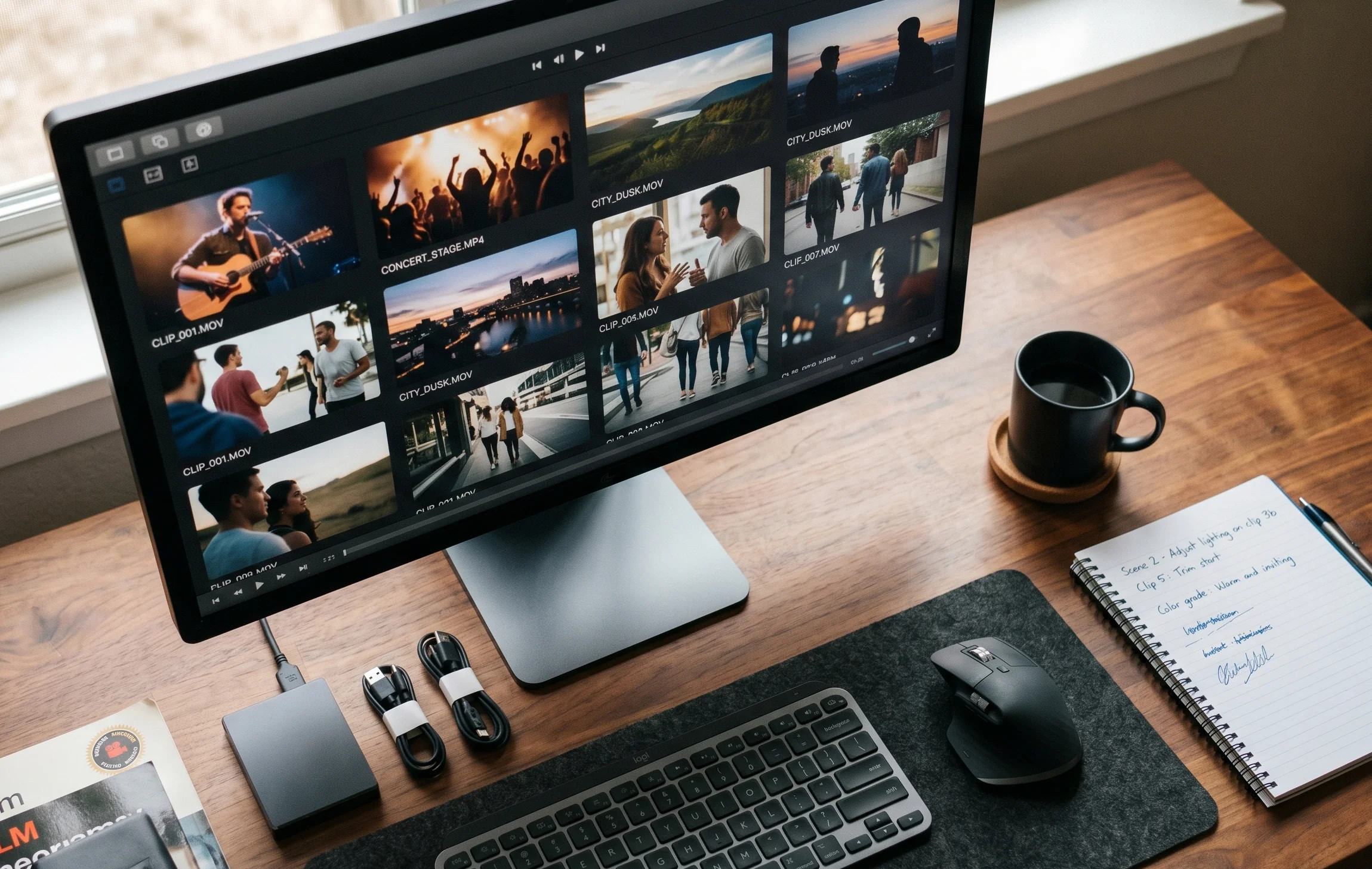
When working with user-generated content at events, you're often dealing with raw footage from multiple attendees. AI-assisted curation helps sort through it, but the editing principle stays the same: keep what's useful, cut everything else.
Accessibility Isn't Optional
Captions aren't a nice-to-have. They're essential. People watch instructional videos in noisy environments. Some people have hearing difficulties. Many people are non-native speakers who read faster than they process spoken words.
Add captions. It's not hard, and it dramatically expands who can actually use your video.
Beyond captions, think about:
- Colour contrast - Can people with visual impairments see what you're highlighting?
- Clear audio - Is your voice understandable without straining?
- Reasonable pace - Are you speaking fast enough to keep attention but slow enough to follow?
Production quality and accessibility directly impact engagement and comprehension.
Distribution and Discoverability
You've made a brilliant video on how to use your platform. Now what? Where does it live? How do people find it when they need it?
The best place is right where people get stuck. If they're looking at a confusing screen, put the video link right there. Don't make them hunt through a help center or search YouTube.
Multiple Touchpoints
Different people need help at different times:
| Touchpoint | When People Use It | Format Needed |
|---|---|---|
| Onboarding email | Before first use | Overview video, 2-3 minutes |
| In-app tooltip | During specific action | Short clip, 30-60 seconds |
| Help center | When actively stuck | Detailed walkthrough, 4-6 minutes |
| Social media | Building awareness | Teaser or highlights, under 60 seconds |
For event attendees, timing matters. They're not going to watch a tutorial before the event. They'll need it in the moment, while they're trying to capture something. Make your instructions accessible on mobile, fast to load, and easy to skim if they just need one specific step.
Measuring What Works
You've published your video on how to use your platform. How do you know if it's actually helping?
The metrics that matter:
- Completion rate - What percentage watch to the end? If it's low, your video is too long or too boring.
- Rewatch rate - Are people coming back to it? That's often a sign it's helpful but maybe not clear enough the first time.
- Drop-off points - Where do people stop watching? That's where you've lost them, either through confusion or irrelevance.
But the real test is simpler: are people still asking the same questions? If you made a video showing how to submit content and you're still getting support requests about it, the video isn't working.
Keeping Content Current
Platforms change. Interfaces update. Your video on how to use the March 2026 version of your app will be wrong by June.
Plan for updates from the start. Record in segments so you can swap out one part without redoing everything. Keep your source files organized. Note which videos correspond to which version.
Better to have a slightly lower production value video that's accurate than a beautifully crafted one that's wrong. People will forgive basic graphics. They won't forgive instructions that don't work.
When your platform evolves, particularly in areas like content curation or consent management, update your instructional content immediately. Out-of-date instructions create more problems than no instructions at all.
The User-Generated Advantage
Here's where it gets interesting for events. Instead of creating every instructional video yourself, let your attendees do it.
Someone figures out a clever way to use your platform? That's gold. Encourage them to share a quick video showing others. Not only does this create more diverse instructional content, it builds community. People see themselves in other attendees, not in corporate messaging.
The best video on how to use an event platform often comes from someone who just learned it themselves. They remember what was confusing. They explain it in terms other newbies understand. They're credible because they're peers, not marketers.
This is the core of what makes user-generated video platforms work for events. You're not just collecting memories. You're creating a knowledge base of authentic, peer-to-peer instructions that scale way beyond what any official team could produce.
Making instructional videos that actually help people isn't complicated, but it requires thinking from their perspective instead of yours. Show what matters, cut what doesn't, and test whether people can actually follow along. When you're running events and need attendees to capture and share authentic moments without friction, clear instructions make the difference between chaos and community. SureShot ApS turns your attendees into confident video storytellers by making the process simple enough that instructions barely matter, but when they do, they're right there in the moment people need them.